
Before we begin, I'd just like to throw out a little reminder: this is just how I go about my painting process. This isn't the 'correct' way or the 'right' way of designing a character. It's just a way that I found works for me. This process won't necessarily work for everyone as every artist is different from one another; it's just a case of finding out what works for you. So, hopefully this won't be boring and will inspire someone somewhere :)
Let's get to it...
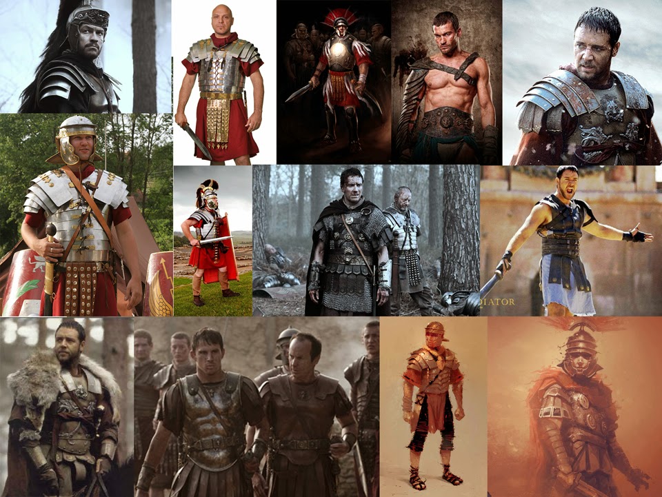 So, the first thing I do when designing anything is by digging out some references and research. I was wanting to create a Roman soldier design for this piece, so I tried to find images that are relevant to the visual style I want to achieve as well as looking at some concept art to see what the competition is like. Sometimes the reference stage can be quite extensive, but with this design I already had an idea of what I wanted, so I didn't spend too much time on it. I'm wanting something a little gritty, a little dark and something believable.
After finding my references, I begin my sketching. The whole point of this stage is to explore ideas, so I like to keep a sense of momentum and get my ideas down very fast and quite rough.
Upbeat rock music and a heavy injection of caffeine is highly recommended.
I don't want to commit to any designs at this point, so I don't spend very long on any one sketch. As this is a personal piece, I like to get a sense of my character and make changes as I go. Working professionally for a client however, I generally spend more time on this stage to create more variations, add in more detail and to neaten them up a bit further. This is so the client has a much clearer idea of what I'm trying to show.

I select the design that I like the most, create a new document and import the sketch. In the early stages of my design, I generally just work in greyscale so I can focus on the tonal values and the design, without complicating anything with colour. Again, this is a personal piece, so it's still quite sketchy but I know in my mind where I want to take this image. As you grow with confidence in your work, you don't need to flesh out every little detail straight away. You become less reliant on it. You just know the details will come eventually. I believe patience truly is a virtue for a concept artist, despite the fact I am, at my core, quite an impatient person!

Next I want to begin implying colour to my design. I think the leap into colour is the part that scares a lot of new artists as they're unsure what to do next. Though I do like working in greyscale, there's a danger that, when you begin overlaying colours on top, the dark greys/blacks underneath will 'muddy' or desaturate your colours creating an overall bland palette. Now, in my mind I know I want my design to be cold, gritty and bleak in colour regardless (it's not meant to be bright and colourful...he's not a Winnie the Pooh for god's-sake), but I want to avoid any potential problems with the colour palette. So this is what I do...
If working on numerous layers, merge the layers down to one. Name it something sensible like 'Character Base'. Duplicate this layer so you have a layer named 'Character Base copy'. Go to to 'Image; Adjustments; Levels' (or CTRL+L for the shortcut). Playing around with the sliders, lighten up your greyscale image so we've eliminated a lot of the very dark/black areas leaving mainly mid-tone to light greys. Chances are, this will lose some of the detail you have painted in, but hey, this a sketch, not the final design. Don't worry about it.
Create a new layer on top of 'Character Base copy', again, name it something sensible like 'Colour Block'. Adjust the Layer properties; this is open to experimentation, but the main one's I generally stick with are Hard Light, Overlay, Soft Light, Screen and Multiply. Using the Soft Air Brushes, begin painting in a rough block of colour. This is not meant to be highly detailed, it's just a quick pass to give you an idea. I generally make a couple of these 'Colour Block' layers to experiment with quickly. It's not by any means perfect, but it's a good way to help visualise the colour palette quickly and eliminate any of the very dark tones.

Using a fairly rough brush, I create new layer (with Normal layer property settings) and start blocking in some rough details. Using the Lasso Tool, I also select chunks of the anatomy and movie pieces around so it looks more comfortable to the eye.

Because I'm painting over the top of my original sketch, I make a small copy of the sketch and just keep it to one side, just as a reference point. I'm wanting to create a character who's a little moody and battle seasoned, so I spent some extra time on the face, including a texture from photo ref for the mouth. If anyone's looking for some good references of faces, here's a handy site: http://www.3d.sk/

I wanted to show the construction of the body armour, so, for the moment, I've decide that the big furry coat is getting in the way of my actual design. So I removed it. When painting, I don't have a 100 percent perfect final outcome in mind. It doesn't work that way. You need to try things, explore your ideas and let them develop naturally.

From there, I continued painting with rough brushes bringing in more refined detail with each layer I add. As I'm progressing through this design, I know there are areas of detail I really want to add in here and there. But I need to stop myself from just throwing them in to the wrong place because sorting out those issues later down the line is only going to create more work myself.

At this point, I added in some photo textures from http://www.cgtextures.com/ to help enhance the sense of believability in my image.
And from here, it's literally just a case of refining areas that look rough and slowly building up the level of detail.


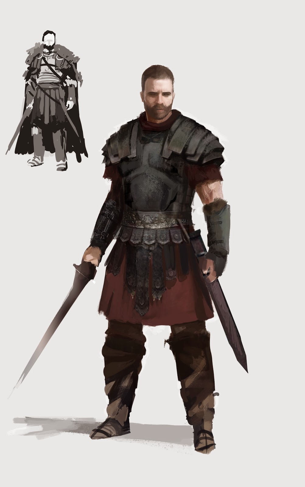
Eventually, I reach a point where I think the design is complete. I expend my canvas, duplicate the character and create the helmet design.

I've got into a little habit lately when designing characters; I like to do two versions of the same design. The first one is quite clean, on a plain background. Something I'd pass over to a 3D modeller who can clearly see where the design is going (hopefully...). For the second design, I like to take that character design into another document and create a sense of the environment this character lives in. Is it hot, cold, snowing, sunny, raining, happy, bright, miserable drab? This way, I have clear visual of seeing what the character would be like in their world. This isn't an essential thing to do, it's just something I enjoy doing.

So yeah, I'm not the worlds greatest writer, but hopefully this will give you some insight into how I developed this character design. As I said earlier, I hope someone, somewhere finds some inspiration here. Keep practising!
Cheers!
Thank you for showing off your process. I think it's quite nice and clear, I'll try to apply it to my next pieces :) !
ReplyDeleteCheers !
Thanks for taking the time to do this. It's great to see the process you've developed (over years of experience I suspect) and how effective it is! Fantastic execution!
ReplyDeleteThis is a great insight in how to approach it. I often spend little to no time on the research and almost immediately want to go into detail. Thanks for posting this =)
ReplyDeleteLove Love Love Love Love Love Love this post of yours! Thank you for spending some time to write this. I am so inspired by you :D
ReplyDeleteGreat and well done tutorial. I gained a lot of knowledge because of this, thanks a lot!
ReplyDelete